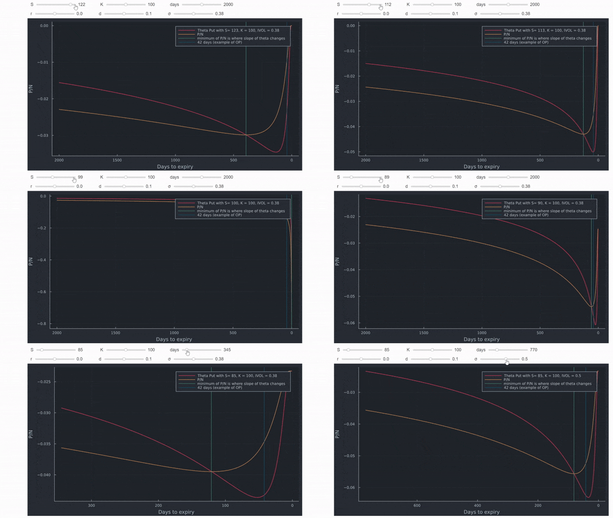
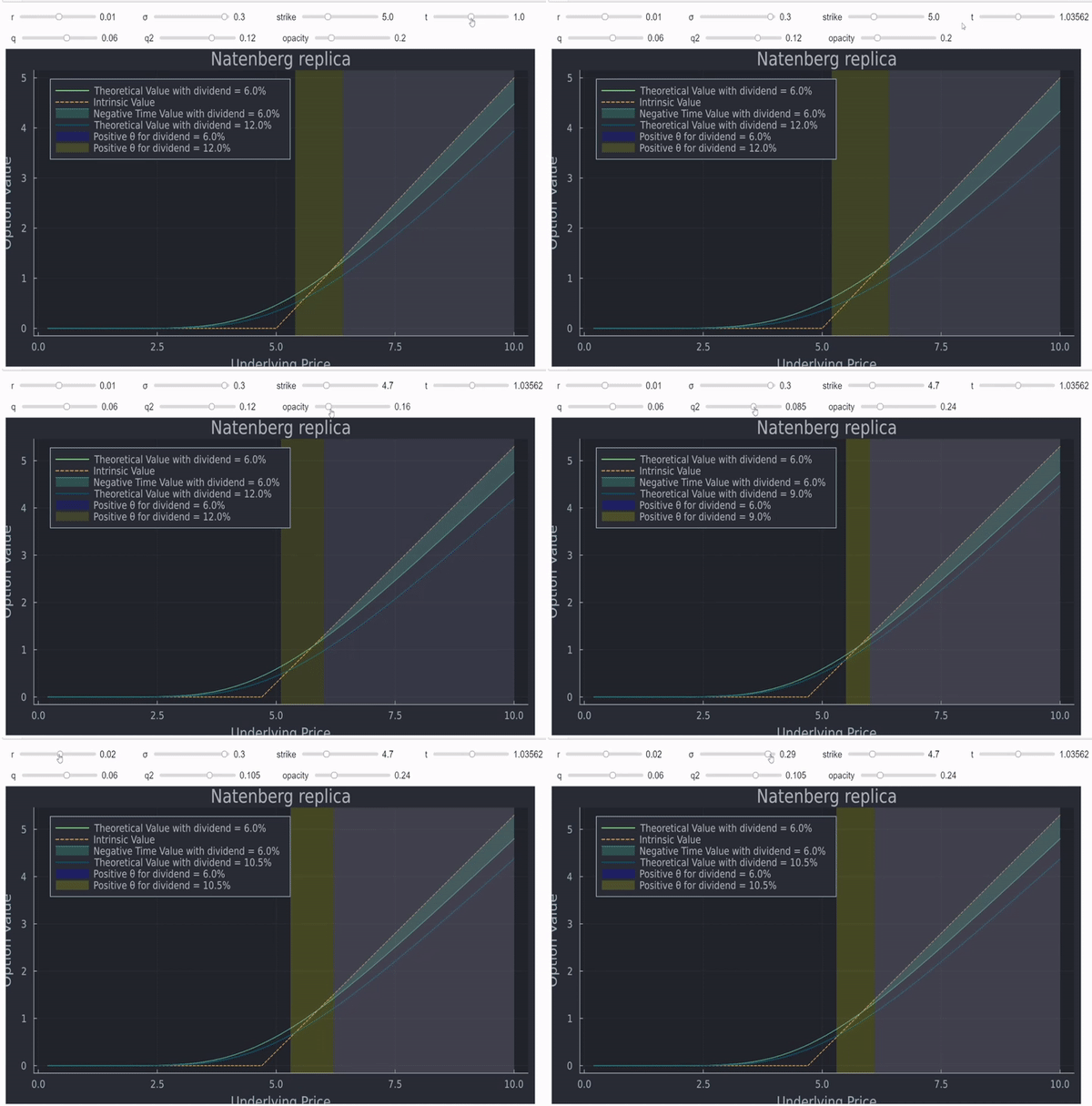
4

Typical option graphs are only valid at the time of expiration: short put option

This only expresses what happens at the moment of expiration (and ignores trading costs).

But what about extrinsic value (theta and implied volatility)? Before expiration option value does not have a linear relationship with the underlying. ATM options have the most theta, theta does not change linearly with time, and rate of change of intrinsic value decreases the further away from ATM the option is (an option $10 ITM may only have $7 intrinsic value).

How do we create a chart modeling all that? Very few options traders seek assignment so the typical charts do not represent their situation.

6 Answers 6

4

enter image description here

As you note, charts typically show the value at expiration. My broker will also show a midpoint along with the current price curve. This seems to be what you want. As Bob notes, these values can all be calculated with an option pricing model, typically Black-Scholes (as D noted). In the graph above, each line is showing profit (loss) vs price, at a given time to expiration.

I found a BS model that is an excel sheet. Easy to tinker to manipulate it for your purpose.

3
  • So the current plot approaches linear as the expiration moves further away. Interesting. Commented Aug 22, 2019 at 19:01
  • That would stand to reason, no? An option expiring exactly at the money is worth zero, but in the money, has an exact intrinsic value. This ignores transaction cost of course. In the old days, the buy/sell commissions were awful, and it was better to sell the option at a discount compared to incurring the full cost of a stock trade. Commented Aug 22, 2019 at 19:22
  • Note, the stock split, so the options are now 400 options to buy Apple at $62.50 at a cost of $3.12. The trade, $1250 cost, is now worth just over $20K Commented Oct 3, 2020 at 1:46
2

ATM options have the most theta, theta does not change linearly with time, and rate of change of intrinsic value decreases the further away from ATM the option is (an option $10 ITM may only have $7 intrinsic value).

An option $10 ITM will have $10 of intrinsic value.

Delta will depict the rate of change of intrinsic value

Typical option graphs are only valid at the time of expiration. Before expiration option value does not have a linear relationship with the underlying. But what about extrinsic value (theta and implied volatility)?

These are valid points that I can provide an answer to but not a solution for. I have an old program that has served me well for 20+ years. It allows entry of many option positions for a single security and provides 5-6 time slice graphs between now and a future date of your choosing (next week, expiration, whatever). The time slices allow you to visualize the changing P&L over time and price.

It calculates the average implied volatility of all option entries and it allows one to change this average IV prior to graphing. This is useful for events like earnings announcements where you can guesstimate the post earnings IV (see IVolatility for historical IV graphs) and model what your position might do.

Unfortunately it is not available commercially but perhaps some broker offers similar analytics.

2
  • Is this a program you wrote or acquired from a friend? Would you consider making it availalble? Commented Aug 22, 2019 at 18:56
  • 1
    I wish that I could but sorry, I cannot distribute this program. Commented Aug 22, 2019 at 22:58
1

How do we create a chart modeling all that?

You could create a contour (3-D) plot with the following axes:

  • Time to maturity
  • Underlying Price
  • Extrinsic value.

Since option value is easy to compute with the Black-Scholes model for various strikes and TTMs (keeping other inputs constant), it should be a straightforward plotting exercise. I would expect the contour to look like a hill at high TTMs, and gradually flatting out as TTM goes to zero.

2
  • So the proper graph is a surface. Makes sense, just add a time dimension to the typical graph. I'm not sure why you would use strike and extrinsic value instead of profit and price like the typical graph. Commented Aug 22, 2019 at 18:59
  • You're right - underlying is more appropriate. For profit, I thought you were looking for the extrinsic (time) value not the payout. the graph for P/L would look a little difference (transitioning from the smooth curve to the hockey stick).
    – D Stanley
    Commented Aug 22, 2019 at 19:19
1

The interactive charts I created here (https://www.5minutefinance.org/concepts/the-greeks) will allow you to plot any of the Greeks as a function of the option pricing model inputs (Black-Scholes).

If you just want to see how the option's time value changes given changes in the Black-Scholes inputs you can see these interactive charts: https://www.5minutefinance.org/concepts/an-introduction-to-stock-options

The code for all the apps is freely available here and here. I created these for teaching purposes (hence only entering stock prices in $1 increments), but given the source code you can easily modify them to accept actual option trades.

1

You can do it quickly yourself if you have a little knowledge of computer programming. For example, Julia's charting capabilities are very good and you can quickly produce interactive figures. The below defines Black Scholes which is sufficient to match Bloomberg as shown here with Python and here with Julia. As long as you have Julia and the packages installed, you can simply copy paste the code to get this to work on your end.

using Plots, Distributions,DataFrames, PlotThemes
theme(:juno)
N(x) = cdf(Normal(0,1),x)
function BSM(S,K,t,rf,d,σ)
  d1 = ( log(S/K) + (rf - d + 1/2*σ^2)*t ) / (σ*sqrt(t))
  d2 = d1 - σ*sqrt(t)
  c  = exp(-d*t)S*N(d1) - exp(-rf*t)*K*N(d2)
  return c
end

Adding a few lines computes the PnL (subtract initial cost), makes it dynamic (with slider for term and vol) and also allows you to play around with different notional values.

original_cost = BSM.(10,10,t,0.0,0.0,0.2)
function call(N, t_new, σ)
    payoff_call = N.*(BSM.(S,10,t-t_new/365.0,0.0,0.0,σ) .- original_cost)
end
function start_val(N, σ)
    payoff = N.*(BSM.(S,10,t,0.0,0.0,σ) .- original_cost)
end
S = 7:0.1:13
using Interact
call_gui = @manipulate for t_new = 1:1:364, σ = 0.01:0.01:0.41,
           Notional = spinbox(label="Notional"; value=1);    
        plot(S,call(Notional, t_new, σ), 
                label = "Call Option PnL in $t_new days ($(t*365-t_new) days left to expiry)", 
                legendposition = :topleft,size = (800,500))    
        plot!(S, start_val(Notional, σ), 
                label = "Call Option Payoff Today with K = 10",
                xlabel = "Spot",
                ylabel = "Pnl",
                size = (700,500),
                title = "Option PnL for K = 10, t = 1 year, 0 divs and rates and 20% vol at initiation",
                titlefontsize=10)
end
@layout! call_gui vbox(hbox(:t_new, :σ, :Notional),observe(_))
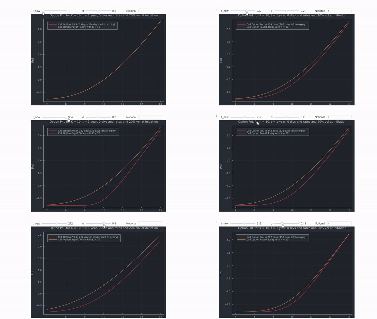
enter image description here

Now most equity markets are American, but in my example, the results would be identical for an American option anyways. In more general cases, you would need to implement this with a model that prices American options (PDE solver for example). In terms of looking at a chart, the differences will be so marginal that you can probably just stick with the European option pricing tool.

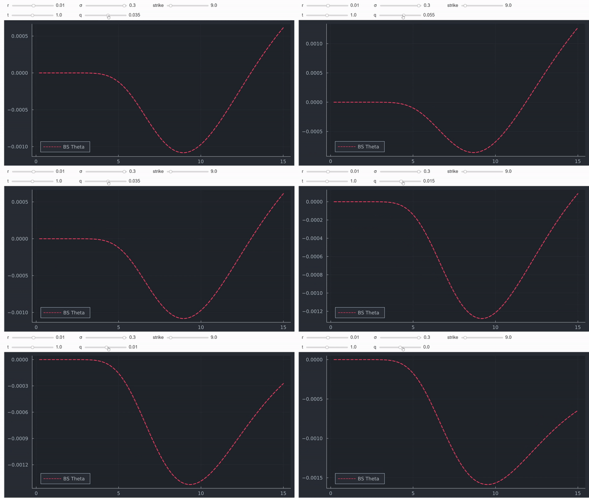
Theta (and all other Greeks) can be done in a similar way, as shown here. Examples below:
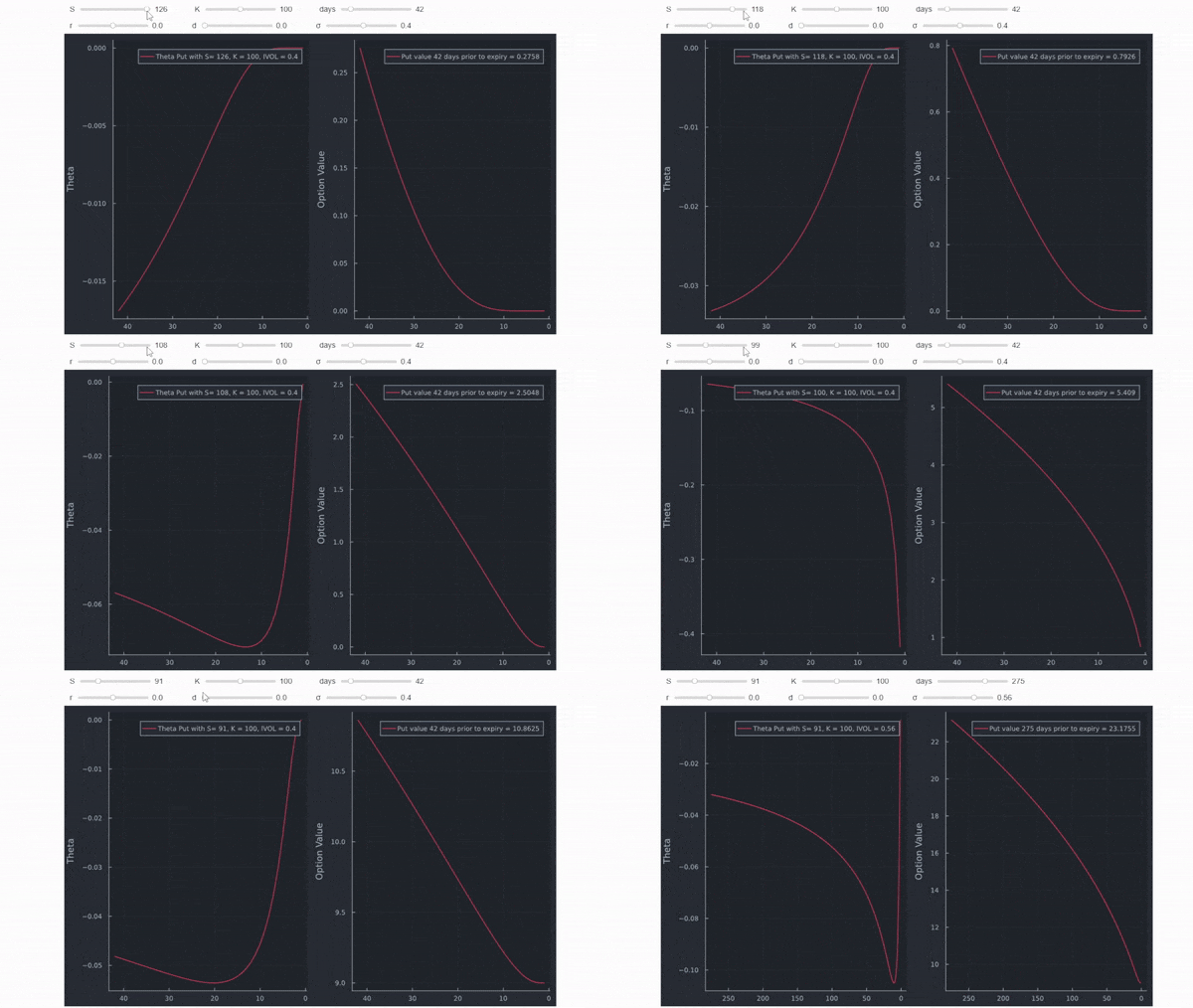
enter image description here enter image description here enter image description here enter image description here

Or if you prefer 3D graphs, 18 lines of code define Black Scholes Merton including most relevant Greeks and chart all of them in one interactive chart:

function BSM(S,K,t,rf,d,σ)
  d1 = ( log(S/K) + (rf - d + 1/2*σ^2)*t ) / (σ*sqrt(t))
  d2 = d1 - σ*sqrt(t)
  c  = exp(-d*t)S*N(d1) - exp(-rf*t)*K*N(d2)
  delta_c = exp(-d*t)*N(d1)
  gamma_c = exp(-d*t)*n(d1) / (S*σ *sqrt(t))
  theta_c =(-(S * exp(-d*t)*n(d1)* σ )/ (2 * sqrt(t)) - rf * K * exp(-rf*t) * N(d2) + d * S * exp(-d*t)*N(d1))/365
  rho_c = ( K*t * exp(-d*t) * N(d2))*0.01
  vega_c = S * exp(-d*t)*n(d1) * sqrt(t)*0.01
  return c, vega_c, delta_c, gamma_c, theta_c, rho_c
end

spot,time, K_range, rf_range =7.0:0.5:18.0, range(0.0,stop=1.0,length=50), 5:0.5:20, 0.0:0.01:0.3

gui = @manipulate for K=K_range, rf=rf_range,d=d_range,σ = 0.01:0.1:1.11,α=0.1:0.1:1, side = 10:1:45,up = 20:2:52;  
    z = [Surface((spot,time)->BSM.(spot,K,time,rf,d,σ)[i], spot, time) for i in 1:1:6]
    title = ["Call Value", "Vega","Delta","Gamma","Theta","Rho"]
    p = [surface(spot,time,z[i], camera=(12,20),α=0.8 ,xlabel="Spot",ylabel="time",title=title[i],legend = :none) for i in 1:1:6]
    plot(p[1],p[2],p[3],p[4],p[5],p[6],layout=(3,3), size =(1000,800))
end
@layout! gui vbox(vbox(hbox(K,rf,d,σ),hbox(α,side,up)), observe(_))

enter image description here

Another advantage with Julia is that it is super fast compared to other high level languages like Python. This is useful here because the short clip repriced ~50,000 options to get all 3D charts including adjustments. You can have a look at some basic explanations for the reason why Julia is so fast here. These are the results: enter image description here

Last but not least, the WOLFRAM demonstrations project has a working app you can play around with that looks like this:

enter image description here

0

I've been using ThinkorSwim for about a decade. It's "analysis" tab lets you model prices at dates, multiple dates, and multiple expirations for multi leg strategies

amongst many other combinations

It is also free.

You must log in to answer this question.

Not the answer you're looking for? Browse other questions tagged .