1

The following plot and its context were taken from Hull`s Options, Futures and Other Derivative Securities (2002).

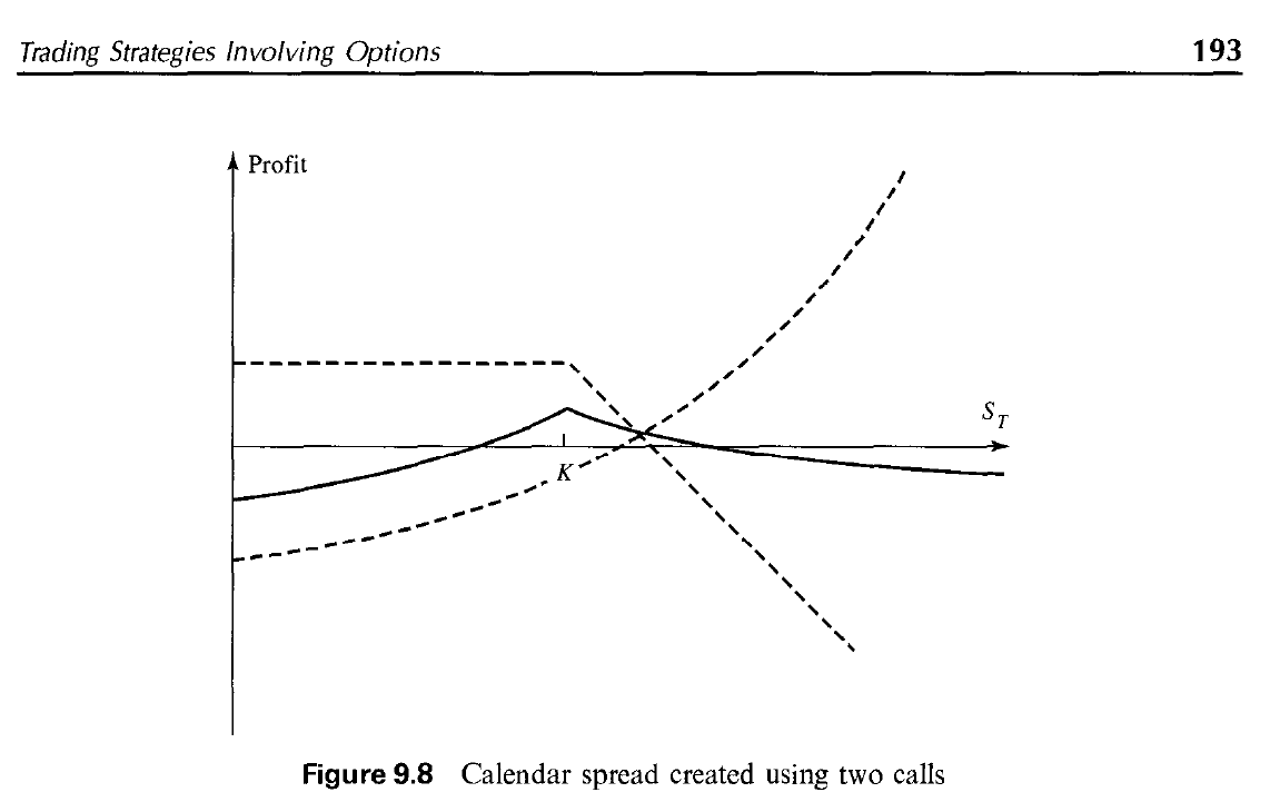
I am slowly getting the basics of financial mathematics and came across this plot that shows a Calendar Spread built with call options. The example considers two call options with same strike price K and two different maturity dates, T1 and T2, where 0 < T1 < T2.

enter image description here

Assuming the dotted line that drops after the stock price reaches K represents Call Option 1 (K, T1), my question is: why is the other dotted line curvilinear?

I've seen the plots for Call Spread Inequality, Put Spread, Butterfly, and some others, and this is the first time that the line showing the outcome of an option is not made of straight lines.

I was thinking - maybe this has to do with the fact that working with different maturities T1 and T2, perhaps T2 is also affected not only by the stock price, but also by how far/how close it is to expiring. If so, shouldn't this be a factor also for Option 1?

2 Answers 2

4

I've seen the plots for Call Spread Inequality, Put Spread, Butterfly, and some others, and this is the first time that the line showing the outcome of an option is not made of straight lines.

The short answer is that Vertical, Butterfly, and Iron Condor spreads etc. have the same expiration. A Calendar Spread does not.

At expiration, a call is worthless if it is OTM and it is worth its intrinsic value (stock - strike) if ITM. This is a 1:1 linear relationship which you can see in the unlabeled upper dotted line which is slanted to the downside at 45 degrees (above the strike price). For every dollar the stock rises, the short call loses a dollar.

Prior to expiration, an option has a delta that is less than 1.00. For a long call, as share price increases, delta increases but at a non linear rate. IOW, for every $ of share price increase, the call's price increases at a faster rate, eventually reaching 1:1 when it is very deep ITM and delta approaches 1.00. This is represented by the arcing upward curve on the right side of option K.

When you combine the numbers from a straight line graph and a curved graph, the end result is a curved graph.

0
0

A call calendar spread has two legs: a long and a short call, with different expirations, and usually the same strikes.

The payoff value of a long call option at expiration is given by max(0, S - K) - C, where S is the stock price, K is the strike, and C is the premium paid for the option. On your plot, the horizontal axis is S and the payoff is the vertical axis Profit.

For a short call, you receive the premium and are responsible to honor the buyer's payoff. That gives a payoff curve for yourself of max(0, K - S) + C. This is the first dotted line, the one on the higher end of the plot from Hull's you pasted as part of your question.

However, the more you move back in time, away from expiration, the sharp bend on the call option payoff curve at expiration gets smoother. The exact smoothness of the curve is a market characteristic, determined in practice by estimation, using actual option prices.

That is what the lower dotted line shows. A long call option (the first equation) farther away from expiration than the short call position. It is an illustration, and it is exaggerated to show that it is far away enough from expiration that the typical bend on the payoff curve you see at expiration is practically gone.

The calendar spread is given by the continuous line, indicating the total payoff of the two legs, the addition of the first and second dotted lines of the plot.

You must log in to answer this question.

Not the answer you're looking for? Browse other questions tagged .