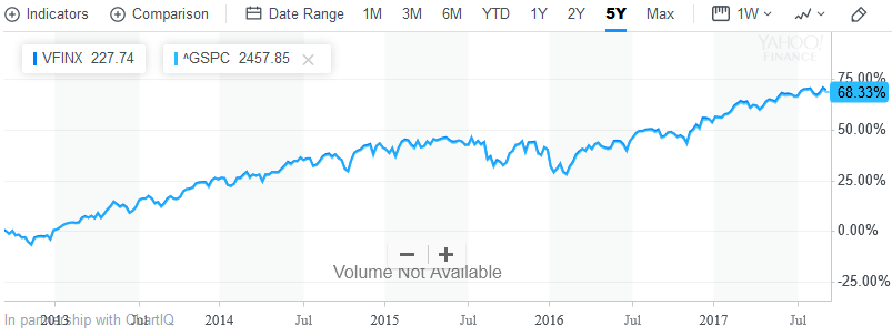
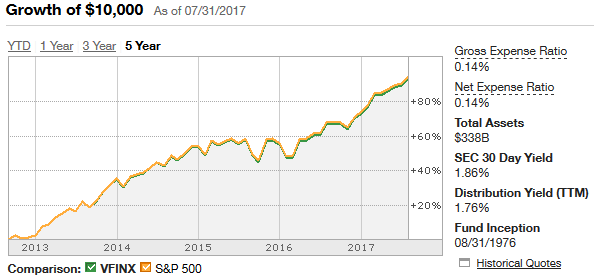
tl;dr: The CNN Money and Yahoo Finance charts are wildly inaccurate. The TD Ameritrade chart appears to be accurate and shows returns with reinvested dividends. Ignoring buggy data, CNN most likely shows reinvested dividends for quoted securities but not for the S&P 500 index. Yahoo most likely shows all returns without reinvested dividends.
Thanks to a tip from Grade Eh Bacon, I was able to determine that TD Ameritrade reports returns with reinvested dividends (as it claims to do). Eyeballing the chart, it appears that S&P 500 grew by ~90% over the five year period the chart covers. Meanwhile, according to this S&P 500 return estimator, the five year return of S&P 500, with reinvested dividends, was 97.1% between July 2012 to July 2017 (vs. 78.4% raw returns).
I have no idea what numbers CNN Money is working from, because it claims S&P 500 only grew about 35% over the last five years, which is less than half of the raw return. Ditto for Yahoo, which claims 45% growth.
Even stranger still, the CNN chart for VFINX (an S&P 500 index fund) clearly shows the correct market growth (without reinvesting dividends from the S&P 500 index), so whatever problem exists is inconsistent:
Yahoo also agrees with itself for VFINX, but comes in a bit low even if your assume no reinvestment of dividends (68% vs. 78% expected); I'm not sure if it's ever right.
By way of comparison, TD's chart for VFINX seems to be consistent with its ABALX chart and with reality:
As a final sanity check, I pulled historical ^GSPC prices from Yahoo Finance. It closed at $1406.58 on 27 Aug 2012 and $2477.55 on 28 Aug 2017, or 76.1% growth overall. That agrees with TD and the return calculator above, and disagrees with CNN Money (on ABALX). Worse, Yahoo's own charts (both ABALX and VFINX) disagree with Yahoo's own historical data.


