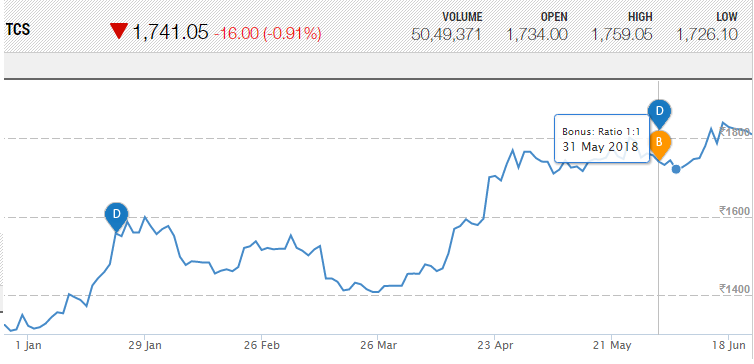
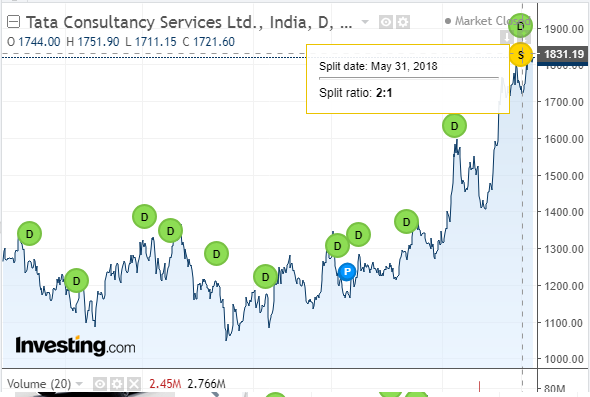
You would need to have remembered the actual stock price before, and compared it to the stock price now. E.g. I remember when GOOG had spent a couple years climbing to about $780, and then blam, it was $112. That was a 7:1 split.
Charts correct for the split. If you looked at a GOOG chart a week after the 7:1 split, the chart would show that GOOG had been in the $100 range the entire time. Working as intended.
As I am constantly explaining to my Board of Directors, business data has a purpose and the presentation should serve that purpose. For instance our business has gate revenue. We pay 10-20% to the booking company and credit card clearinghouse. The Board loves puffing up our numbers by claiming $24,000 gate (and $4000 fees) when the real spendable money from gate is only $20,000, and that is the number the Board should ponder.
So the charts are distilling the info down to what most chart users need to see: the actual market performance of the company. Showing a 2:1 lurch there would provide no useful info and only make the chart harder to read.


